Project Fact File :
Name of the Project: Clifton
Project Location: Thane, Maharashtra, India
Project Completion Year: January 2020
Carpet Area: 1180 Sq.ft.
Photography Credits: Prashant Bhat
Team Aum: Manish Dikshit, Sonali Pandit, Nachiket Borwake
Project Description
Ar. Manish Dikshit, Founding Principal of AUM Architects came up with a coalesce of class and flamboyance with his recent residential design “Clifton”. Blending his favourite minimalistic contemporary design style with a new-fangled eclectic approach; Manish wraps up the bare canvas
given by the client in his open-ended brief with exhilarating surprises. The client’s brief highlighted only the functional regime of spaces; giving the design team a free hand on the planning. The objective was to achieve a barrier-free space that exemplified a multifaceted domain.
Setting out the steppingstones to attain an exclusive aura the lustrous metallic and clear glass entrance door welcomes the guests into this flawless sphere. A transition space has been assimilated between the entrance door and the main door in which on one side lies a fascinating wall treatment
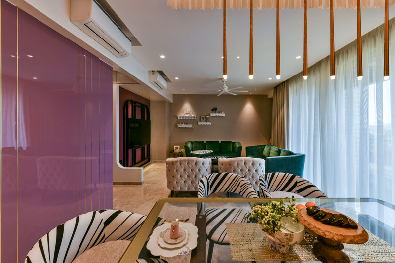
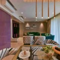
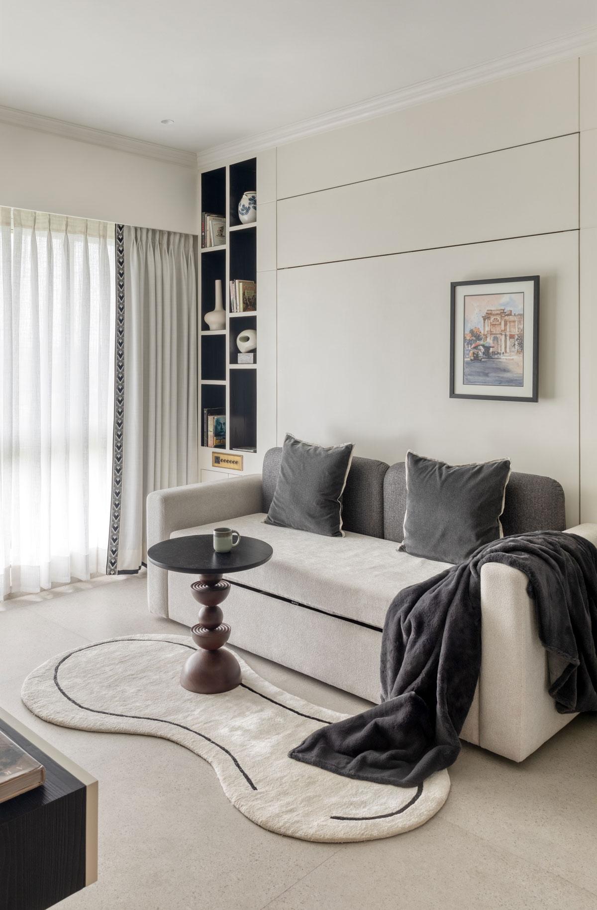
and complete mirror cladding is done on the opposite wall in order to create an illusion of volume. One enters the artsy living cum dining room through the main door where keeping the forms to be minimal, the confluence of distinctive colours serves as the focal facet of the expanse. The grape
high-gloss wall with gold metal inlay on one side complements a darker hue of grape colour with black matte metal inlay adorning the TV wall. The rest of the walls are covered in a beige wallpaper including a matte sheen while balancing out the colour scheme; granting the living room a chic sense
of sophistication.
The furniture pieces inculcated form to be art in themselves- the bespoke console finished in wood and Mimosa hued PU finish. Accents of the mimosa tone have also been displayed in the showstopper custom art in the dining area. The dining table acquires a base finished in veneer with
intersecting metal bars in gold; the tabletop is in clear glass with a complimentary gold back-painted border. The dining chairs’ fabric in stripped pattern adds a tint of pattern amongst the solid colours used overall.
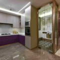
Moving further, the living room leads to the kitchen; as one walks towards the kitchen, they catch a glimpse of the mandir. In order to retain the mandir as an extension of the kitchen, the facet is fabricated in clear glass. The grey marble floor continues from the kitchen into the mandir; however, handmade tiles integrated in the centre of the mandir gives a delusion of vibrant carpet design. The mandir comprises hints of grey, copper metal accents and chrome.
The kitchen is outlined with a modern take manifesting a British influence through the inculcation of aubergine colour laminate for the under counters instilled with copper-toned handles. The kitchen top is pristine white with ash grey glossy tiles laid in a herringbone pattern; while the overhead unit has been kept subtle with a fine fabric texture laminate. The colour palette introduced emanates the volume of the space.
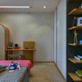
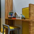
Meandering forward with the design, the kids’ bedroom is a minimal concoction of accents of grey and sunflower yellow. The room was designed in a way to add vitality, keeping in mind the childhood years of the two boys who will live here. The laser-cut polka dots on the white acrylic sheet pasted over sunflower yellow laminate on the wardrobe, rubberwood study table and book unit, accentuate the vivacity of the design.
Combining a gleaming colour scheme and resonant material palette, the master bedroom is a perfect fusion of style, elegance and opulence. The material palette constitutes marble tech tiles, wooden side tables, a rich burgundy headboard that wraps around the bed and a grey wallpaper
with filigree work that adds texture in the room. A prepossessing wallpaper is glued onto the ceiling from the approach door to the mirror that forms an interesting demarcation of the passage. Lighting became a critical aspect in this room as it comprised an enormous window granting natural light and the schema was kept more towards the darker side. Hence, pendants and ceiling lights were inculcated in the room in order to achieve a perception of lights washing the walls.
Underscored by luxury, the palette for the classical guest bedroom room was kept subtle with copper metallic accents, placid blue on the wardrobe, champagne toned wallpaper and wooden flooring. Mouldings contrived on the wardrobe shutters and the soft grey cornice running on the
periphery of the ceiling underlines the classical cadence of the area.
“Clifton” forms to be a brew of fashions marking its presence amongst the multitudinous luxury residential designs. The design of this house is a sheer corollary of plethoric compositional styles ranging from being geometrical and passionate about posing for a sophisticated flamboyance.
READ ALSO
https://arivaalifestyle.com/projects/welcome-abode-by-ankur-ahuja/

